Table of contents
“Fourteen years before writing these Confessions, I had gone to New York and started an advertising agency. Americans thought I was crazy. What could a Scotsman know about advertising?
My agency was an immediate and meteoric success.”
These are the words with which David Ogilvy start off his legendary Confessions of an Advertising Man.
I wasn’t sure what I was getting myself into when I began flipping through the pages of this book.
I thought I had purchased an autobiography—one which, if I was lucky, might teach me something about the creative industry.
But as I came to find out as I was flipping through the pages of this book after it had been sitting on my desk for a couple of months, it is much more than that.
First, a short biography of David Ogilvy:
David Ogilvy—a brief biography
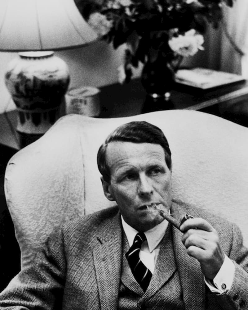
David Ogilvy CBE (1911 – 1999) was born into a British upper-class family in 1911. He received a scholarship to attend Oxford University but was soon expelled for poor academic performance.
He went on to work as an assistant chef at Hotel Majestic in Paris for a year, before he returned to the UK to become a door-to-door salesman in Scotland. He was eventually hired as an account executive by the British advertising agency Mather & Crowther. In 1938, Ogilvy convinced his employer to let him work at Dr. George Gallup’s Audience Research Institute in New Jersey for a year. He would later credit much of his success to what he learned working for Dr. Gallup.
During World War II, he worked for the British Intelligence Service and became an alumnus of the secret Camp X, a British paramilitary installation located in Canada, where, he was trained in sabotage and close combat, as well as propaganda and psy-ops.
After the war, Ogilvy lived among the Amish for several years, before moving to Manhattan.
With the backing of his old employer Mather & Crowther, which was now run by his brother, he successfully launched an advertising agency on Madison Avenue—Ogilvy & Mather.
Over the years, Ogilvy and his ad agency did work for Rolls Royce, Sears, the British government, the state of Puerto Rico, Dove, Shell, and dozens of major brands in the CPG industry.
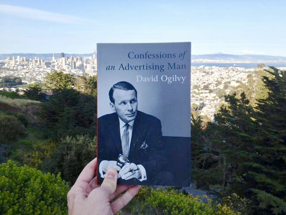
Confessions of an Advertising Man (1963)
David Ogilvy wrote this iconic book in 1963, fourteen years after launching his wildly successful advertising agency. Confessions quickly became an international bestseller, selling millions of copies and being translated into 14 languages.
Media Week called it “Required reading for anyone in business.”
Like I said earlier, I wasn’t sure what to expect from this book.
I thought it might be an ordinary autobiography, containing one or two nuggets of wisdom from one of the titans of Madison Avenue.
I was mistaken.
The autobiographical aspect of the Confessions is merely a backdrop used to communicate lessons in leadership, client acquisition, client management, copywriting, and advertising—among other things.
Confessions doesn’t concern itself with the abstract. Nearly every single paragraph is used to dispense some practical truth or piece of advice.
It is, in short, a practical guide to advertising.
The structure
It’s difficult to find any fault in the structure of this book. The table of contents is, just like the book itself, extremely practical:
1. Foreword
The foreword, written by Sir Alan Parker, praises Ogilvy’s genius and explains the cult status of the book, but also warns of presumed embellishments about Ogilvy’s life.
2. The Story Behind This Book
In this chapter, added in 1988, Ogilvy explains the raison d’etre of Confessions, briefly talks about cheap clients, corporate culture, and other things that are given a more in-depth treatment later on in the book.
3. Background
The origin story of David Ogilvy; from growing up in Lewis Carroll’s old house in Guildford, to being on Sir William Stephenson’s staff in British Security Coordination.
4. How to Manage an Advertising Agency
Principles of leadership, mostly told through anecdotes about Ogilvy’s days as a chef in the kitchen of Hotel Majestic in Paris. The principal role of a good leader: to provide an atmosphere in which creative mavericks can do good wor. Ogilvy also shares principles for being a good employee.
5. How to Get Clients
Acquiring clients as a small agency; addressing size objections; methods of self-advertising; the sport of sales; showing enthusiasm vs. indifference; the importance of setting criteria for prospective clients; how to avoid being pigeon-holed; and the importance of being honest and showing your flaws.
6. How to Keep Clients
Cultivating long-term and mutually beneficial relationships with your clients; the importance of candour; why you constantly need to “resell” your agency to corporate clients; how to give more effective presentations.
7. How to Be a Good Client
Fifteen rules to extract the best possible service from your agency; questions to ask before firing an agency.
8. How to Build Great Campaigns
Ten principles of creating great campaigns; the importance of investing in a consistent brand image; the importance of Great Ideas; the role of facts in advertising.
9. How to Write Potent Copy
Features of effective headlines; features of effective body copy.
10. How to Illustrate Advertisements and Posters
Importance of story appeal and of great photography; advice on how to break up longer copy; mostly incorrect statements about design.
11. How to Make Good Television Commercials
This chapter is very brief owing to the novelty of television in 1963, and David Ogilvy’s inexperience with the medium; mostly contains general principles about advertising campaigns.
12. How to Make Good Campaigns for Food Products, Tourist Destinations and Proprietary Medicines
The value of content marketing, social proof, and fashion; the importance of never straining credulity.
13. How to Rise to the Top of the Tree – Advice to the Young
Becoming an expert on your clients’ businesses; how to blow your competition out of the water; how to navigate office politics; how to build a personal brand.
14. Should Advertising Be Abolished?
In this chapter Ogilvy presents anti-advertising and pro-advertising arguments from various economists, and argues for the economic benefits of advertising (to the public, not just individual companies).
15. A Collection of Ogilvy-isms
A short and incomplete list of the quotes & aphorisms David Ogilvy was known for, for example:
“It is important to admit your mistakes and to do so before you are charged with them.”
Confessions is well-written, practical, and entertaining. I cannot recommend it enough; it is truly a fantastic read.
However, the book is not without faults: in a couple of places, he offers advice (especially about design) which is sadly misinformed. I am sure that, in the spirit of admitting one’s mistakes and being honest, Ogilvy would have conceded these points had he only been better informed.
Points of contention
Here are the points which, after careful consideration, I have decided that Ogilvy is incorrect about:
1. Advertisements set in reverse (i.e. light text on a dark background)
Ogilvy talks about this as if it were a cardinal sin of design. You will find his statements on pages 21 and 139:
And, expressed more forcefully:
Look at this advertisement from Apple:
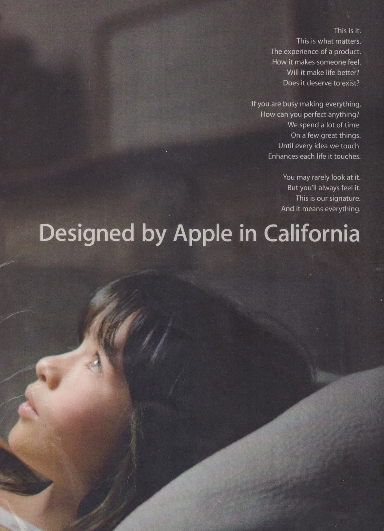
Were you able to read that? Good. So it should be clear that reading copy set in reverse is—in fact—not “physically impossible” at all. Not even close.
See, the reason why white text on dark backgrounds can be less legible is that lighter-value elements tend to bleed into the void of darker-value regions, causing them to look “heavier” on a dark background.
This can pretty easily be accounted for by increasing the tracking (i.e. letter-spacing) of the lighter-value letters.
One might also opt to set the type in a light-grey/off-white color, and use a not-quite-black background to prevent the bleeding from happening in the first place.
So why would you reverse type in the first place? I’m sure there are many reasons why. The main ones that come to mind are:
-
To emphasise something and draw people’s attention there
-
To create a visually appealing design
-
To break up blocks of text and make content more digestible
I’m sure these are all benefits that David Ogilvy would value very much, had he been better informed about the ways in which you can make reverse type just as legible as normal type.
Overall though, I think far too much emphasis is placed on legibility as opposed to aesthetic appeal.
Of course it’s important that people can read your text.
But beyond achieving a baseline level of legibility, marginal improvements in this area are very seldom worth the large sacrifices you have to make in terms of visual interest & dramatic effect.
It doesn’t matter that your text is 0.1% more legible if it looks so plain and boring that no one bothers to read it in the first place.
2. The role of content and form in advertising
On page 110, Ogilvy claims:
He is wrong. (And he also goes on to contradict himself on pages 133 and 135.)
We are visual creatures at heart. The written language is—in the grand scheme of human evolution—a fairly recent invention.
Our brains are still wired to make decisions based on subtle visual cues. For most of human history, failure to do this fast and accurately would often lead to a gruesome death.
The modern field of behavioral economics is constantly proving that form matters just as much as, if not more than, content in guiding people’s decisions.
As Ellen Lupton states in her book Design is Storytelling:
For example:
That last bit may explain Ogilvy’s error. As a staunch adherent to research and consumer surveys, he had no doubt found that consumers reported that their decisions were informed by the content of advertisements. More on the dangers of relying too much on consumer surveys shortly.
For more on how our decision-making is influenced by design—and other seemingly irrational factors—see Leonard Mlodinow’s Subliminal: How Your Unconscious Mind Rules Your Behavior, and this Psychology Today article adapted from the book.
3. The importance of “balance, movement, and design”
Quoth David Ogilvy:
This seems like pure arrogance on the part of Ogilvy. Balance, movement, and design can create clarity and guide users to interact with something in a certain way. Not only do we look for and prefer objects that are visually pleasing to us; failure to resolve issues like balance and movement leads to confusion (and boredom) and makes whatever content you have worthless.
4. Serif vs. sans-serif type
This was indeed long thought to be the case. More recent research, however, is inconclusive:
As long as you are choosing between high-quality options, the choice of serif vs. sans-serif ought to be based on style, tone, and personality—not hardly-noticeable differences in legibility.
As a side note: Ogilvy seems to really have it in for the Bauhaus school. Regardless of what you think of them, it’s silly to fault them for this supposed design “sin” when Joseph Albers, an influential Bauhaus figure, sings the praises of serif type (and criticises sans-serif type) in the first chapter of his magnum opus, Interactions of Color.
5. Advertisements that entertain
Finally, Ogilvy sets up an interesting dichotomy:
That between advertisements that entertain, and advertisements that sell.
Based on research by Horace Schwerin, he claims that:
Modern research into the neuroscience of advertising would contest this view. Here’s Peter Murray, Ph.D. in consumer psychology, in Psychology Today:
Moreover, he continues:
“Research conducted by the Advertising Research Foundation concluded that ‘likeability’ is the measure most predictive of whether an advertisement will increase a brand’s sales.”
Clearly, the idea that the likeability of an advertisement has no impact on how effective it is in generating sales, both runs counter to common sense (why would we buy from a brand if we don’t like what they’re saying to us?) and modern psychological and neuroscientific research.
So what’s happened since Ogilvy’s time? Did the facts change?
That’s doubtful.
The more likely situation is this:
Ogilvy, shaped by his time working for Dr. Gallup’s research institute, put too much stock in consumer surveys.
Douglas van Praet, whose agency created the wildly successful Volkswagen advertising campaign known as “The Force”, warns against the dangers of using marketing research as a crutch:
By the way—here’s his Volkswagen ad, which he goes on to say might not have made it through the traditional research process:
Concluding thoughts
One can easily look past these errors. Considering Ogilvy’s Confessions were written some 55 years ago, at a time when the scientific disciplines of behavioral economics and neuroscience were hardly even invented, it is surprising that there aren’t more errors to be found.
I’m sure some of the technical copywriting advice may be dubious or outdated—that’s not my expertise so I’ll abstain from commenting on it. But overall, Confessions is an extraordinarily useful and educational book, which, to this day, serves as an obligatory textbook in many advertising schools.
This book has a lot to offer anyone who’s looking to become a better business owner, regardless of what industry they’re in. For people interested in marketing, it’s required reading.
PS. If you found this article interesting, you’ll love my previous one. It’s about Ogilvy’s 7 principles of marketing, and is full of great quotes from Confessions.

Jon Persson
Jon Persson
Hiring a designer? Grab this.
My Pre-Hire Checklist gives you valuable tips to consider before hiring an identity designer.