The key to designing better websites isn’t using a certain typeface… It’s not using this or that illustration style, or art-directed photography…
It’s not about what design software you use or how the website is built.
There is no magical way to lay things out on a page in order to create the perfect website.
All those things matter, but only as second-order effects, informed by a primary, unifying principle that makes or breaks a web design.
So what is that principle?
How do you design better websites?
One weird trick…
Empathy. It’s all about empathy.
You have to be able to put yourself in your users’ shoes. The better you are at doing this, the better your website can be.
Don’t get me wrong.
Principles of visual design are extremely important factors contributing to the overall user experience of your website.
But design, properly understood, is about so much more than creating something visually pleasing.
The purpose of design is to produce a certain result.
A certain design can be considered successful only insofar as it achieves the result(s) it was tasked with achieving.
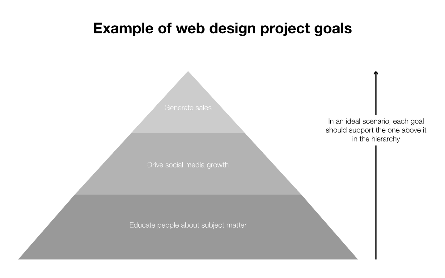
Usually, in web design, we try to achieve more than just one result at once. But if you’ve gone about things the prudent way and started with creating a solid strategy, the goals can usually be ordered into a hierarchy.
Here is one simple example from a client project I’m working on at the moment:

In this example, we have three outcomes that we’re trying to achieve:
-
Website users who match our ideal customer avatar become customers
-
Users follow the company on Instagram and Facebook
-
And lastly, users are educated on the subject matter of horse-racing
A great deal of web design projects (although not all!) share the same primary goal: to drive sales. However, very seldom is it the only goal. You need other goals to support it.
Some elaboration on the graph
In this case, the client sells partial ownership in racehorses.
Unlike many companies in the same industry however, this one puts a great amount of emphasis on the softer aspects of owning a racehorse, as opposed to stressing the potential financial upsides (owners all get a cut of any prize money).
These softer aspects — getting to know your horse, following its everyday life and becoming emotionally invested in its well-being — makes social media a really effective marketing tool.
If we can get people to follow the company on Instagram, there’s a fairly good chance they will end up becoming customers a few weeks or months down the line.
Lastly, by creating high-quality educational content about horse ownership and horse-racing, we have a sustainable way of generating organic traffic from Google and other search-engines. This creates increased top-of-the-funnel awareness and expands the pool of potential customers.
In other words: All the other goals support the primary goal of generating sales.
Wait, what does any of this have to do with empathy?
Ha, great question, dear reader!
We’ve gone on a bit of a tangent here, but don’t worry: it’s not for nothing.
It is only once you have a larger purpose in mind that you can employ empathy effectively in your design.
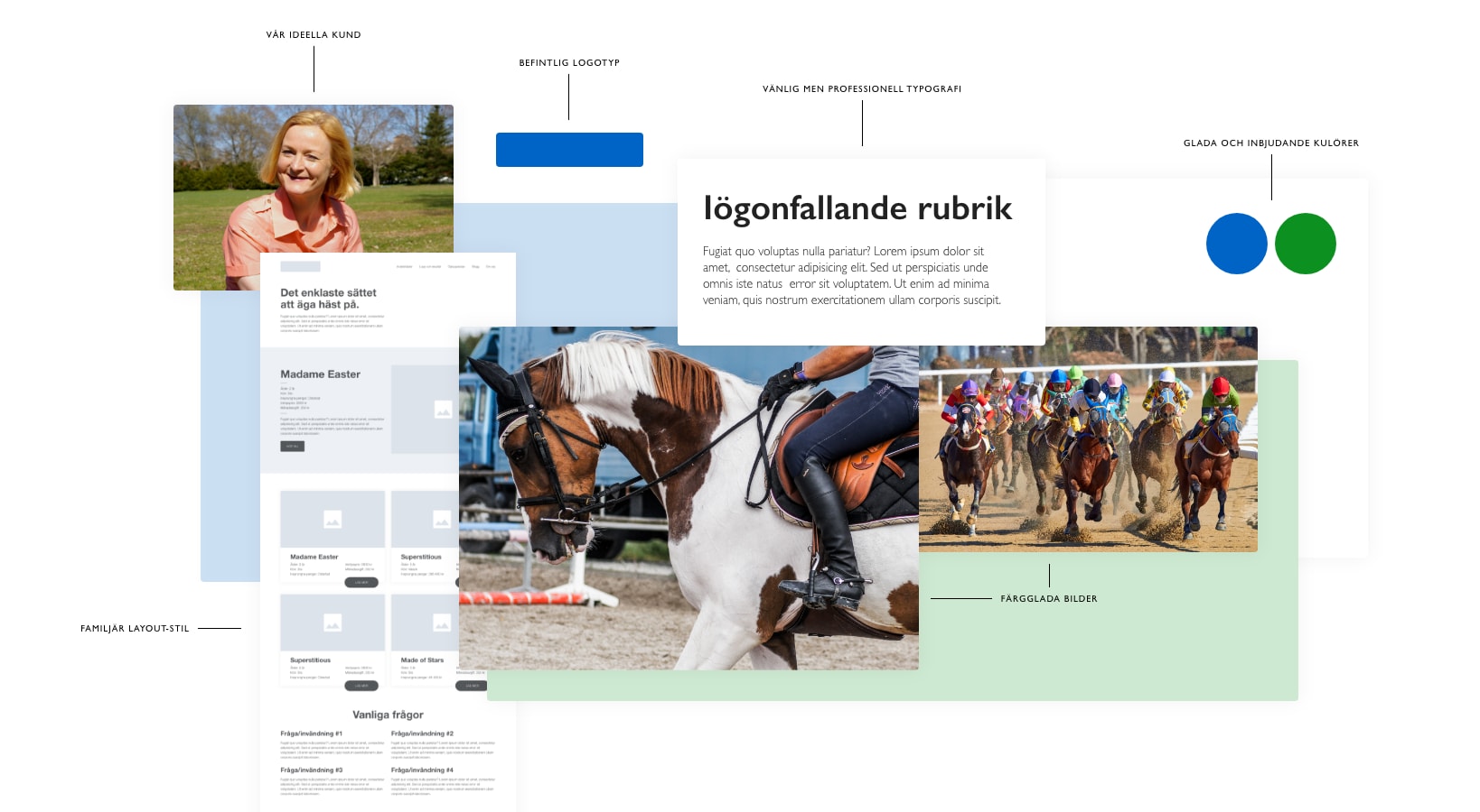
If you know what you’re doing (e.g. generating sales), and who your audience is (e.g. middle-aged women who have a dormant interest in horses and are looking for a new hobby), you can begin to use empathy to come up with great ways of serving your audience.

Website features, layouts, typography choices, aesthetic direction… All of these things will start to fall in place once you put yourself in the shoes of your ideal customer.
Because once you do that, you begin to appreciate what your customers’ needs are and how you can go above and beyond in solving them.
That is how you build better websites, sell more stuff, and perhaps most importantly: have happier, more loyal customers.
Finally, to wrap things up… Watch this short Youtube video by Israeli designer Ran Segall on the subject of empathy and creating great user experiences:
Until next time,
Jon.
