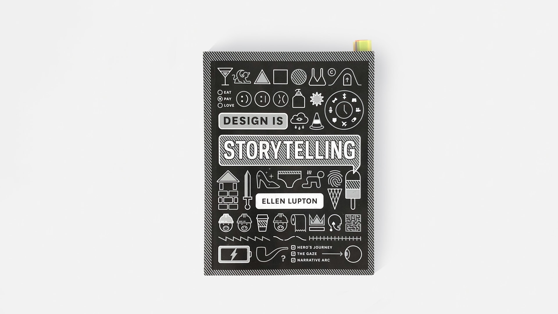
Ellen Lupton’s Design is Storytelling is structured in a way that escapes proper description.
The book has no overarching narrative.
Instead, it highlights individual tools, principles, and ideas that—to some extent—are relevant to a broader theme:
The psychology of design, approached from the perspective of storytelling.
Despite being only 158 pages long, the book covers a ton of ground.
Readers are introduced to concepts from writing, design, as well as psychology and behavioral economics.
We’re even given a crash course in the evolution and biology of human eyesight.
So you can appreciate how difficult it is to get a solid grip on this book. Despite its name, Storytelling doesn’t really contain a coherent narrative.
Perhaps the best way to understand it is as a collection of answers to the question that the author, Ellen Lupton, asked herself as a young art student in the early 1980s:
As a student, I felt that problem solving didn’t account for everything I wanted to know about design practice. Problem solving wasn’t enough. What about beauty, feeling, and sensation? What about humor, conflict, and interpretation?
So rather than putting my own “spin” on the book, I’m going to highlight the three concepts/tools/principles that I enjoyed reading about the most.
First up:
1. Rule of threes
The number three has long been a fascination of mine. It seems to appear everywhere:
-
The rule of thirds—a technique to create pleasing compositions in the visual arts.
-
Plato’s division of the soul into three parts: the rational, the libidinous, and the spirited.
-
The Holy Trinity, the threefold office of Christ, the Catholic division of the afterlife into Hell, Purgatory, and Paradise.
-
The three beasts in Dante’s Infero blocking the Pilgrim’s path, forcing him to turn around and journey through Hell and Purgatory with Virgil.
-
The three transcendentals: Truth, Goodness, and Beauty.
-
The Fimbulwinter of Norse mythology, which precedes the end of the world, Ragnarok, consists of three harsh winters without an intervening summer.
-
Three is considered a lucky number in Chinese culture.
-
Ed, Edd, and Eddy.
The list could go on forever, but I’m going to stop here.
In Design is Storytelling, Ellen Lupton explains how both writers and designers use the rule of threes to make a greater impact on readers and users:
A simple task has three easy steps, and a story has three basic parts: beginning, middle, end. Writers and comedians use the rule of threes to create lists whose last item is unexpected, as in ‘life, liberty, and the pursuit of happiness’ or ‘sex, drugs, and rock ‘n’ roll.’ In each of these phrases, the last element breaks the pattern set in motion by the first two. Designers use three-part structures to construct stories and interactions that surprise and satisfy.Ellen Lupton, Design is Storytelling, p. 40
Apple’s famous “3 Steps” ad from 1998 used this device to illustrate how easy it was to get online using their new iMac.
Casper, the mattress company, also ran a successful subway ad campaign which utilised the rule of threes by revealing a plot twist in the final frame.

2. Colour and emotion
Colour is immensely powerful.
On the one hand, colours carry different symbolic meanings in different cultures. At the same time, they can produce visceral, emotional responses that are nearly universal across cultures and peoples.
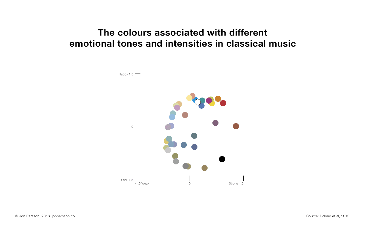
Researchers in the U.S. studied whether or not emotional responses to classical music (Bach, Brahms, Mozart) was 1) consistent across subjects, and 2) correlated with assocations to colour.
They found that the happy, upbeat music of Bach was consistently associated with light, bright, and warm colours. The slower, moodier compositions of Brahms, meanwhile, were linked to deeper, cooler tones.

But that’s only half of the equation. Like I said before, colours not only have the capacity to reflect moods and emotions; they can also affect them.
For example:
Research suggests that reds, yellows, and oranges tend to make people feel energised and activated—whereas blues and purples make people calm and focused.
What’s this got to do with storytelling?
Studies like these suggest that not only can color represent an emotion or mood, but color could—under optimum circumstances—lead people toward experiencing that mood. A compelling story inspires people to feel emotions, not just to witness them. Narrative helps us shuttle between representation and experience, between cultural convention and embodied, felt response.
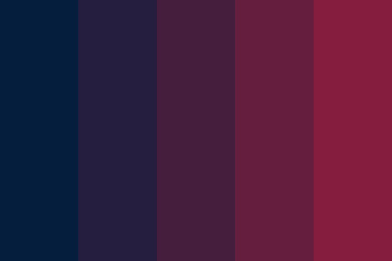
How do these colour palettes make you feel?

3. Behavioral economics
Most of the decisions we make on a day-to-day basis escape rational analysis.
Even the decisions that we make after careful considering our options and doing a cost/benefit analysis, are influenced by our subconscious on a most fundamental level.
No matter how hard we may try, we can never fully escape the irrational nature of our minds.
Behavioral economics studies the psychology of decision-making.
Even the most subtle design elements can influence our actions. By choosing a particular colour or size, designers can “nudge” users in the right direction. Design is used to get people to buy a product, opt-in to become an organ donor, or click a link.
There’s an interesting study where participants were given three boxes of detergent to test and evaluate: one box was yellow, one was blue, and one was both blue and yellow.
The study found that participants, on average, preferred the detergent in the multicoloured boxes. They claimed it had superior performance to the detergent in the other boxes. The thing is, though, the detergent in the other boxes was identical. The only real difference was graphic design.
In conclusion
If this review seemed like it was all over the place, I ask that you forgive you me. If you take one thing away after reading it, let it be this:
Design doesn’t just reflect certain emotions. It’s not simply a visual representation of your brand’s values, or your target demographic’s aesthetic sensibilities.
Design affects people’s emotions, influences their decisions, and shapes their perception of your product or service. It can make someone think a food product is healthier and better-tasting than it actually is. It can help someone focus, or cause anxiety and stress.
That is why design is storytelling.
