Sales pages.
Whether you’re selling SaaS (Software as a Service), an online course, or a physical product, you probably need one, and you might even have one right now.
Like Facebook advertising and the latest iPhone model, it’s something most people assume they should have — and for good reason, too. A good sales page can be an extremely effective way of selling your product—especially if you drive traffic to it using your email list or paid advertising.
As a result, there’s a plethora of different sales page builders that promise a relatively easy set-up at extremely low costs. Tools like ClickFunnels and OptimizePress are ubiquituous on the market. Particularly in the online space, it seems as though just about everyone uses them.
Here’s the problem though:
They’re not very good. They suck.
And frankly, I don’t know why anyone would expect otherwise from low-cost DIY options. You always get what you pay for.
With very few exceptions, the amount of money you invest in something stands in direct proportion to your return on investment.
Now, this doesn’t mean that everyone should invest thousands of dollars in sales page designs. If you’re just starting out, if you’re trying to validate your product idea, and don’t have much money to spend, it makes total sense for you to go the DIY route. I recommend Instapage, which starts at $69/month.
If you have an established business, or have some starting capital, you will likely be better served by finding a competent designer to work with (you might even want to work with me!).
Regardless of where you’re at on the entrepreneurship ladder though, you should at least be able to identify good sales pages from bad ones, and analyse what makes them good or bad.
But first, let’s talk about sales and design.
What is sales?
When most of us think of sales, we probably imagine some shady used car salesman selling faulty products at much too high prices, or annoying telemarketers, or some Glengarry Glen Ross type character. These people rub us the wrong way, and with good reason.
But sales is so much more than that. To sell is to communicate, and to communicate is human. It’s vital to your success not just as a business owner, but in life in general.
And the important thing to note is this: you don’t have to use high-pressure sales tactics and manipulation in order to sell effectively.
Think about it. What boxes need to be ticked in order for you to feel comfortable purchasing something?
- You need to know what the product is and does (features).
- You need to know what it’s going to do for your life (benefits).
- You need to like and trust the company making the product and the person selling it.
And, as one of my clients, Alexander Cortes, likes to say — truly great selling is about storytelling.
[Original tweet no longer available]
So. Does it educate and does it connect with the audience? There’s your benchmark for an effective sales page.
What is design?
Design can be many things. I offered one definition in my article on the value of design: Design—stripped to its bare essentials—is finding the most ideal solution to a practical problem.
Obviously, that’s suuuuper abstract. In this particular context, I think we can define it more narrowly and tangibly as:
- Arranging content to support a greater narrative
- Creating visual interest in order to gain and retain the reader’s attention
Of course, good design should also reinforce the content aesthetically, i.e. form and content should match one another.
So with that out of the way, let’s get into it.
What to look for in a sales page
Roughly speaking, a sales page can (and should) be judged by the following criteria:
-
Is the content easy to read?
-
Does it read well at every “level”?
-
Is the page visually appealing?
-
Are the benefits clearly stated?
-
Are the features clearly stated?
-
Is the price clearly stated?
-
Does it have credible social proof that’s relevant to the target audience?
I will elaborate on each point below.
1. Readability
This is the most basic test that your sales page needs to pass.
Is the content readable?
If your sales page reads like a vertically arranged edition of War and Peace with no visual division, you’re kidding yourself if you think anyone is going to read it.
There are so many things vying for our attention these days that it’s difficult enough to get someone to read an Instagram caption, let alone “a giant wall of text that is only out to get my money, anyway”.
See, here’s the thing about walls: by nature, they’re impenetrable. You can’t peak through them to see what’s inside. Doesn’t matter if they’re made out of bricks or words.
Break up your body copy using different typographic elements like headings, subheadings, bulleted lists, numbered lists, blockquotes and pullquotes, horizontal rules, and images.
Use bold and italic styles sparingly and strategically.
Don’t make your paragraphs too long, but don’t make all of them super short either.
Divide your text into different sections and make use of UI elements (even simple boxes will do) to create a clear visual hierarchy that is super easy and inviting to read.
2. Readability at every level
Beyond this, your page needs to read well at every level.
What do I mean by this?
Well, not everyone has the same reading style. Some people will only skim through your page and try to pick out the most important parts by reading large headings, pullquotes, and perhaps a list or two. Finally, they might read the first and last sentences.
Some people will only look at your headings and your images, and maybe glance at your image captions for context.
Other people will read all of your page, from start to finish.
There are probably just as many ways to read a page as there are people.
You need to make sure that your page makes sense even if you don’t read every single word of it. You should be able to extract the most important information by simply scanning the page casually.
If your sales page falls short of this requirement, you’re alienating the majority of your potential customers (unless your target demographic is people who compulsively read every word put in front of them or something).
As a side note, if you do a sufficiently good job of catching people’s interest with your headings and other easily scanable content, a lot of “casual” readers are actually going to end up reading the rest of your content too.
3. Visual appeal
This relates to the previous two points pretty strongly:
If your page looks boring or ugly, people won’t want to read it.
We are visual creatures at heart, and we judge things by the way they look all the time.
That is why you wouldn’t show up to a job interview wearing wifebeaters and flip-flops, or to a date wearing sweatpants.
If someone dresses like a hobo, we assume they’re a hobo, and we usually don’t give them the benefit of the doubt. If someone wears expensive, tailored suits we assume they’re wealthy, and we give them the benefit of the doubt.
These assumptions may not be correct 100% of the time, but it’s how we think.
Similarly, if your sales page looks boring, we assume the content is boring — and we’re not gonna give it the benefit of the doubt.
If, on the other hand, your sales page looks fantastic, you can get away with more in terms of the content — because our overall impression is a positive one and we’re not cynically looking for things to object to.
Aesthetic appeal = persuasion multiplier.
4. Are the benefits clearly stated?
The main question we have when visiting a sales page is this:
What’s in it for me?
The answer to that question is referred to as “benefits” in sales and copywriting.
Your product’s benefits should be stated plainly, clearly, and early on in the sales page. In fact, they should be one of the first things that people see.
If people don’t understand what your product is going to do for them, they have literally no incentive to dig deeper and read more — let alone buy it.
Openmind, a company that promises to accelerate your learning by connecting you with knowledgable mentors, starts by expressing their value proposition (a form of benefit), then lays out tangible benefits that are relevant to their different customer avatars. Then they go into more detail and explain how their features relate to their benefits.
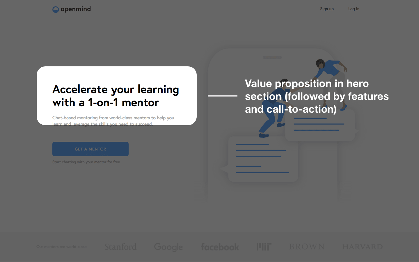
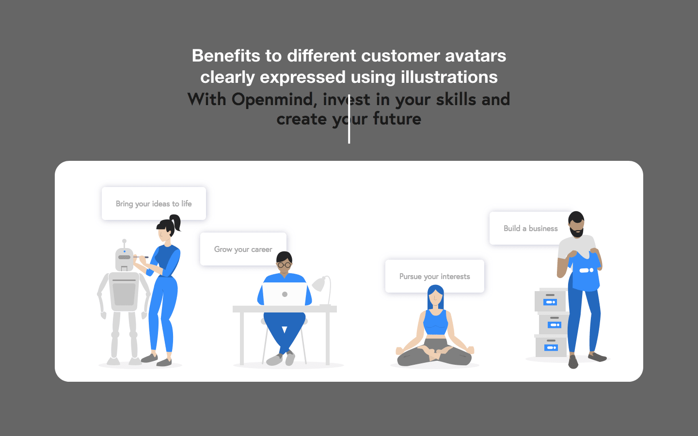
Openmind’s landing page is a great example of a beautifully designed and planned-out sales page that doesn’t contain a lot of text, but still gives people exactly what they need to know before buying. The information is relevant, informative, and clearly stated.
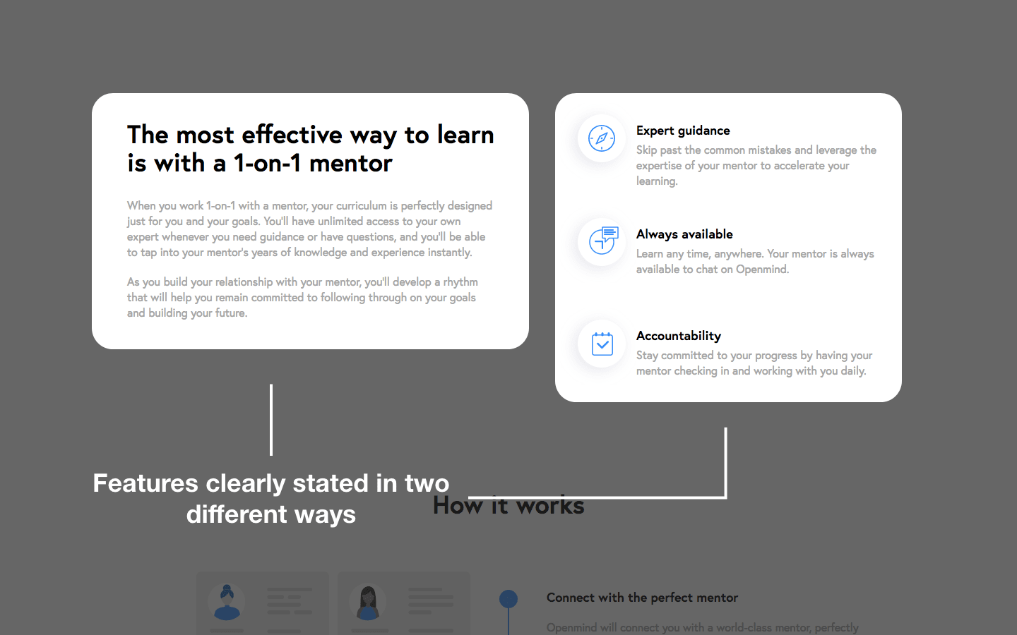
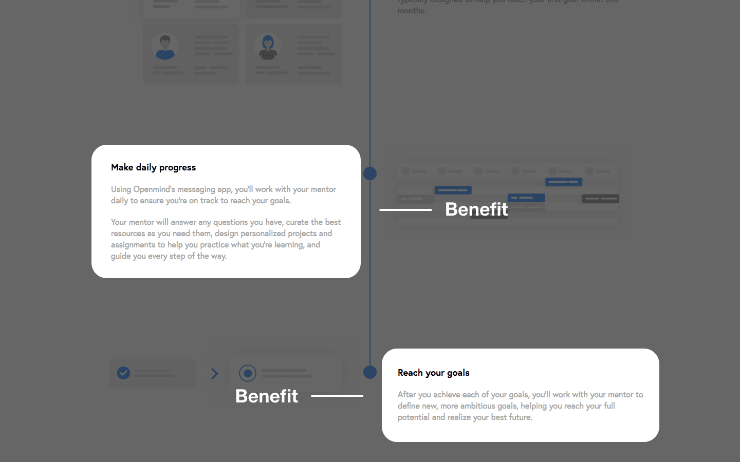
5. Are the features clearly stated?
Okay, so at this point your prospective customers should have a pretty good idea of what’s in it for them.
There’s one problem though:
Very few people are willing to buy something without knowing what that something is.
So you need to explain exactly what is included in the product, and how it works.
If it’s a service, what is the process like? If it’s a phone, what are its specs? If it’s a SaaS, what functionalities does it have? If it’s an info-product, what are the modules/chapters/sections? I think you get the idea.
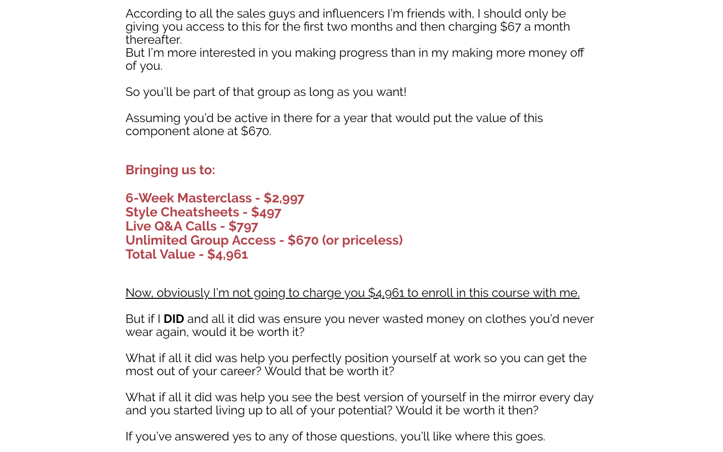
6. Is the price clearly stated?
There shouldn’t be any confusion about the price.
In the first design breakdown I recorded and put on Youtube, I noted that, as a way of justifying the product price and demonstrating its value, the creator had assigned arbitrary monetary values to different modules of the product.
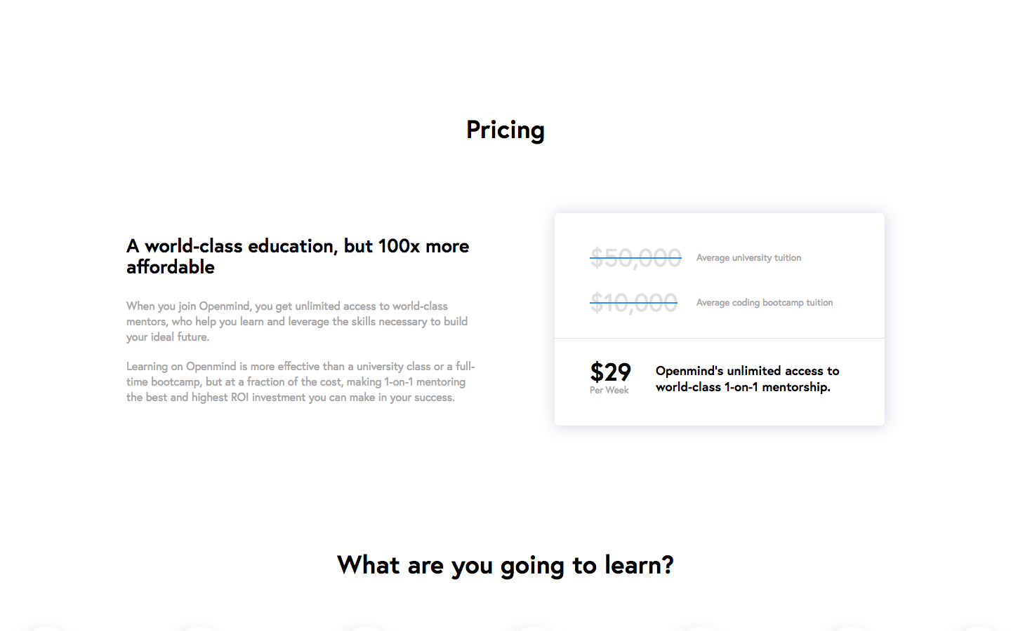
Now, I’m not sure how effective that technique is — I think most people are going to see right through it and dismiss the arbitrary values as… well, arbitrary. There are better ways to do these “comparisons” — for example by showing the cost of other, more expensive options on the market.
Openmind, for example, compares the price of their subscription-based mentor service to the cost of traditional university educations and coding bootcamps:
7. Does it have credible and relevant social proof?
Social proof is really important in sales. We are more likely to buy a product if we know that:
- Many others have purchased the product too
- The people who bought it were happy with their purchase
- Someone we know, like, and trust recommends the product
(1) and (2) are why reviews on Google, Yelp, and TripAdvisor can make or break a restaurant. (3) is why celebrity endorsements are so powerful, and why many companies will pay online influencers tens of thousands of dollars to promote their product.
The thing is, reviews and testimonials only work if they seem real. It has to be obvious that an actual human being actually gave the testimonial.
Inserting a completely anonymous quote into your sales page is not going to do much of anything to move the needle for you. You need to attach a name and face to that quote. And, preferably, you should also include a link to that person’s social media profile or website.
Of course, the most effective type of testimonial is the video testimonial. If you can get a few of those, you’re set.
Side note about testimonials: Make sure your testimonials actually come from real customers. There are a lot of people that will be “spokespersons” for your company or product and essentially give a fabricated testimonial without ever trying the product.
Trust is hard to earn and nearly impossible to regain once lost. If you pay one of these spokespersons to promote your product, you are jeopardising the credibility of your company forever.
Critiquing a real sales page
Theoretical knowledge is valuable, but it’s only actually useful if you’re able to apply it.
Watch me apply the principles mentioned in this article as I critique a real sales page—promoting an online course in the $500 price range:
Wrapping up
So, to reiterate the main points of this article:
#1. Only use tools like OptimizePress or ClickFunnels as a last-ditch alternative if you can’t afford to have your sales page custom-made by someone who knows what they’re doing.
#2. Always keep in mind the boxes your sales page needs to tick:
- Is the content easy to read?
- Does it read well at every “level”?
- Is the page visually appealing?
- Are the benefits clearly stated?
- Are the features clearly stated?
- Is the price clearly stated?
#3. Try to tell a story with your content and design.
That’s it for this article! I hope it’s been really valuable to you, and let me know if you have any questions about sales pages (or web design in general).
And, of course, if you’re looking for a sales page pro to help you out, shoot me an email.