Design. What is it, really?
What makes good design good… and bad design bad?
These are some of the questions that Paul Rand explores in his classic treatise, “Thoughts on Design”. This essay is considered by many to be the manifesto of modern graphic design, and Rand is celebrated as one of the greatest graphic designers of the 20th century.
But who was he?
Paul Rand—a brief biography
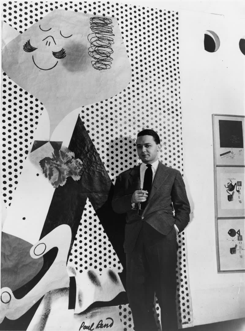
Paul Rand (born Peretz Rosenbaum, 1914 – 1996) grew up in a strict Orthodox Jewish household in Brooklyn. His father—Itzhak Yehuda—owned a grocery store, which everyone in the household worked at. Rand recalled that his father’s clientele included members of the “Jewish mafia”, who “were always polite and paid in cash”.
In the beginning of his career, Rand decided to camouflage his very Jewish identity betrayed by “Peretz Rosenbaum”. “Peretz” was shortened to “Paul”, and the surname “Rand” was borrowed from one of his uncles. Thus, the first corporate identity Rand ever created was his own.
The Paul Rand brand quickly became a success. His work—especially his cover designs for the Direction magazine (which he produced for no fee in exchange for full artistic freedom)—began to garner international acclaim, and Rand’s career was off to the races.
But the work that Rand came to be best known for was his corporate identities. He created logos and corporate identities for IBM, ABC, Ford, UPS, and many, many more.
Before he started making logos for large multinationals though, Rand wrote his classic essay “Thoughts on Design”. And that is what we will focus on here.
Thoughts on Design (1947)
Paul Rand wrote this seminal text of graphic design at 33 years old, when he still had most his career ahead of him. In it, he laid out his vision for what modern design out to be, and articulated what he thought to be perennial principles of design.
This blog series is called Judging books by their covers, so to kick things off I’ll make some brief comments about the book design itself.
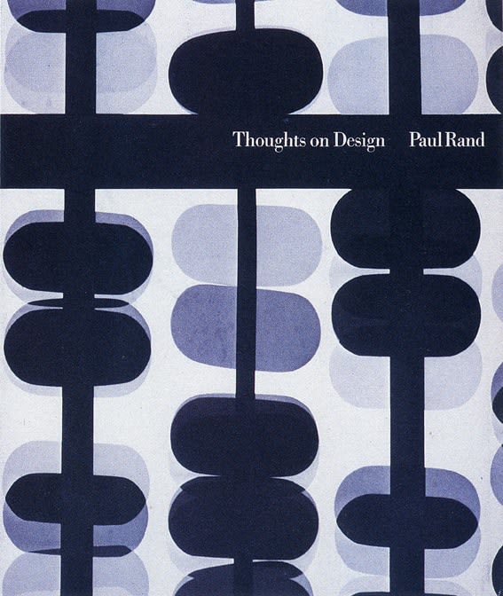
The cover of the book is abstract and monochromatic. The medium, I think, is a photogram, of which Rand says the following:
It is not a picture of the object, but the object itself.
The repeat pattern is hypnotising, but I’m not sure it is beautiful or even visually pleasing.
The book itself is printed on glossy papper and typeset in Linotype Bodoni Book. There’s not much in the way of margins between the typographic matter and the edges of the paper, which creates a lot of friction. There is also a notable lack of scale contrast: I think only two different point sizes are used in the entire book—one for headlines and body text, another for margin notes and image captions.
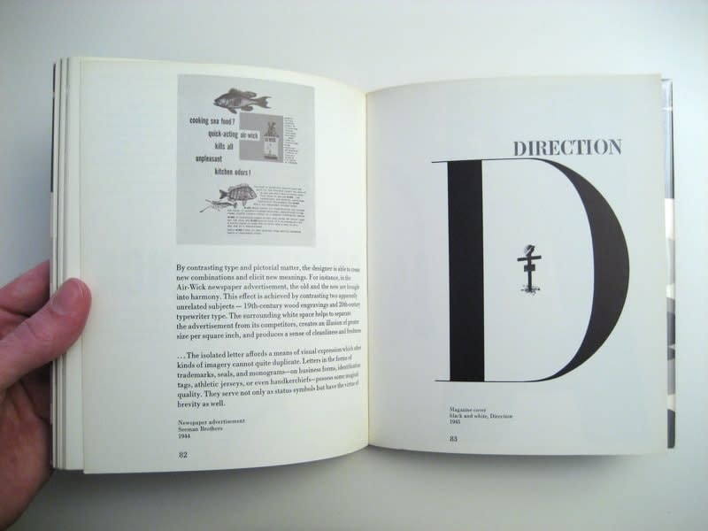
I would not call the book’s typography, or cover design, “beautiful”. But the different images displayed throughout the book (all taken from Rand’s own portfolio) are.
Moreover, the way they are laid out on the pages is dynamic and brings interest to the otherwise dull layout.
The Beautiful and the Useful
Graphic design —
which fulfills esthetic needs,
complies with the laws of form
and the exigencies of two-dimensional space;
which speaks in semiotics, sans-serifs,
and geometrics;
which abstracts, transforms, translates,
rotates, dilates, repeats, mirrors,
groups, and regroups —
is not good design
if it is irrelevant.
Graphic design —
which evokes the symmetria of Vitruvius,
the dynamic symmetry of Hambidge,
the asymmetry of Mondrian;
which is a good gestalt;
which is generated by intuition or by computer,
by invention or by a system of co-ordinates —
is not good design
if it does no co-operate
as an instrument
in the service of communication.
Graphic design … is not good design if it is irrelevant.
This is how Paul Rand kicks off the first chapter of the book, “The Beautiful and the Useful”.
Now, I’m not a huge fan of free verse. Actually, I cringed reading the above paragraphs (and then once more, reproducing them here).
But looking past that, his point is this:
Design is not a fine art. It is not an end unto itself, but “an instrument in the service of communication”. Designers are skilled craftsmen—not artists. We combine form and function to communicate messages and ideas visually.
Rand does not embrace any one design aesthetic with his free verse. Rather, he expresses what—according to his thinking—is a perennial principle of design, which spans across periods, genres, and cultures.
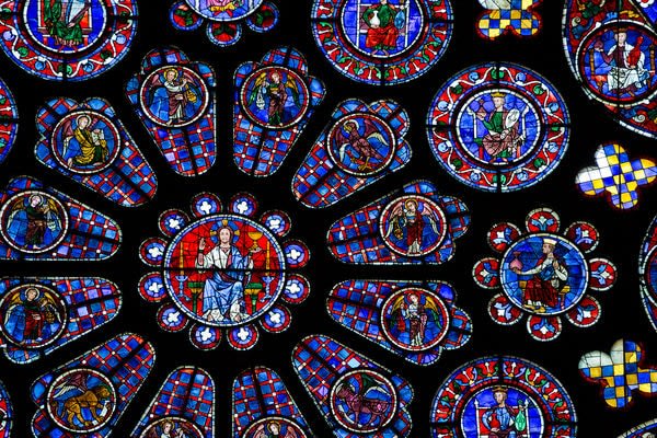
In the past, rarely was beauty an end in itself. The magnificent stained-glass windows of Chartres were no less utilitarian than was the Parthenon or the Pyramid of Cheops. The function of the exterior decoration of the great Gothic cathedrals was to invite entry; the rose windows inside provided the spiritual mood.Paul Rand, Thoughts on Design, p. 10
Honestly: to me, this seems like a reductionistic and bordering-on-cynical interpretation of architectural and cultural history. Rand is of course correct that the architectural features of the cathedrals did do all those things, but it is misleading to say that this was the purpose of the features. Despite this, Rand’s attempt to discover a perennial “design tradition” and reconcile his own views with those of the artists who helped build European civilisation is, I think, a well-intentioned one.
And in fact, this attempt to move beyond the old conflict lines of traditionalist and modernist schools of thought is a recurring theme in this book. Here on typography, in the chapter Yesterday and Today:
Disputes arising between the two schools of typographic thought, the traditional on the one hand and the modern on the other, are, it seems to me, the fruits of misplaced emphasis.
In the same chapter, Rand goes on to quote John Dewey:
Great original artists take a tradition into themselves. They have not shunned but digested it. Then the very conflict set up between it and what is new in themselves and in their environment creates the tension that demands a new mode of expression.
Thesis, antithesis, synthesis. The dialectic is working, folks.
Main themes and takeaways
Though the book is short (95 pages), it contains a lot of ideas. Below are the ones I found most notable and interesting.
Some of them are abstract and theoretical, others are actionable and practical.
-
The role of the designer is not to create pleasing arrangements out of various elements; it is to reformulate ideas and messages, to symbolize and express them, to remove superfluities, create clarity and generate interest
-
Man lives in a world of symbols, and symbols are the common language through which the designer communicates with the spectator
-
The Cross is the earliest of all symbols, and it is found everywhere—even independently of Christianity. Aside from the Crucifixion of Christ, it can also symbolise the union of the Male and Female, as well as God and Earth
-
Always aspire to say the commonplace in an uncommonplace way
-
Don’t be too “in-the-face”, leave room for the imagination
-
Steer clear of visual clichés and use contrast and friction to elicit new meanings and challenge the spectator
-
Don’t use symbols indiscriminately; this washes down their meaning. Instead, contribute to their meaning through interpretation, juxtaposition, association, and alteration
-
It is the mark of a good designer to be able to get the spectator engrossed in the advertiser’s product
-
Great original artists don’t reject tradition, they take it into themselves and digest it
-
In typography, readability is often overemphasised at the expense of style, individuality, and the effectiveness of the design itself
-
Perfect symmetry is too obvious. With asymmetric balance the designer is able to achieve greater reader interest; the challenge it poses to the spectator creates intellectual pleasure
-
Abandon literal approaches and always avoid mediocrity
And, finally…
Even if it is true that the average man seems most comfortable with the commonplace and familiar, it is equally true that catering to bad taste, which we so readily attribute to the average reader, merely perpetuates that mediocrity and denies the reader one of the most easily accessible means for esthetic development and eventual enjoyment.